


Insights
Conversión
Copy Link


Cómo un diseño llamativo, una velocidad móvil lenta y una navegación deficiente acaban con las conversiones: priorice la claridad, la velocidad, la estructura y las pruebas continuas.
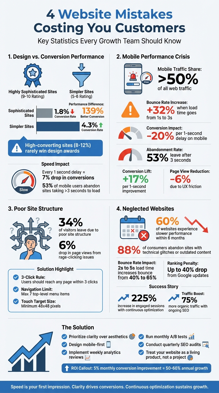
Es posible que su sitio web le esté costando clientes, incluso si se ve muy bien. Muchos equipos de crecimiento priorizan los diseños llamativos por encima de la funcionalidad, lo que lleva a tasas de conversión bajas. Por ejemplo, los sitios web con diseños más simples (con una calificación de 5 a 6) obtienen conversiones un 139% más que los más sofisticados (con una calificación de 9 a 10). En este artículo se destacan cuatro errores comunes que cometen los equipos y cómo solucionarlos:
¿La solución? Céntrese en la claridad, la velocidad y la mejora continua. Utilice los datos para guiar las decisiones y establecer prioridades diseño que prioriza los dispositivos móviles, y prueba y refina tu sitio con regularidad para seguir impulsando el crecimiento.
Muchos equipos de crecimiento cometen el error de pensar que un sitio web magnífico equivale automáticamente al éxito. Pero esta es la verdad: los diseñadores se centran en la estética, mientras que los clientes potenciales se preocupan más por la claridad y la comprensión. Cuando estas dos prioridades chocan, las conversiones se ven afectadas.
Tomemos este ejemplo: una auditoría de 147 sitios web reveló que aquellos con un diseño muy sofisticado (con una puntuación de 9 a 10) generaron solo un 1,8% de conversiones. Por otro lado, los sitios más sencillos (con una puntuación del 5 al 6) obtuvieron una tasa de conversión del 4,3%. Esto supone una diferencia de rendimiento del 139%. ¿La comida para llevar? Es posible que los sitios web que generan buenas conversiones (que suelen alcanzar tasas del 8 al 12%) no ganen premios de diseño. Son simples, funcionales y se centran en los resultados.
Cuando los equipos persiguen las tendencias de diseño en lugar de resultados medibles, surgen problemas. Algunas funciones, como los fondos de vídeo de alta resolución, el desplazamiento en paralaje y las animaciones personalizadas, pueden parecer impresionantes, pero con frecuencia no aportan valor. Peor aún, las tendencias utilizadas en exceso, como el morfismo de vidrio, pueden hacer que los sitios web parezcan genéricos, lo que indica una falta de pensamiento estratégico.
Las desventajas técnicas son aún más difíciles de ignorar. Estos elementos llamativos requieren marcos de JavaScript pesados, lo que ralentiza la carga de la página. Y la velocidad importa, y mucho. Por cada segundo adicional que tarda una página en cargarse, las tasas de conversión caen un 7%. Además, el 53% de los usuarios de dispositivos móviles abandonará un sitio si tarda más de tres segundos en cargarse. Si a esto le sumamos la confusión que provocan los mensajes vagos e «inspiradores», los visitantes se quedan preguntándose qué es lo que hace realmente su empresa, a menudo en los primeros segundos críticos.
«Si el diseño web es 'decoración de interiores', Conversion Architecture es el modelo de la casa. Decide dónde están las puertas, cómo fluye el tráfico y si la estructura resistirá la presión».
Pasar de las tendencias visuales a los principios de diseño prácticos es clave para crear sitios web que realmente generen conversiones.
Para impulsar las conversiones, un sitio web debe responder inmediatamente a tres preguntas clave: «¿Estoy en el lugar correcto?», «¿Puedes resolver mi problema?», y «¿Qué hago ahora?». La claridad es la reina y el diseño debe respaldar los objetivos de conversión, y no al revés.
Así es como los sitios web exitosos abordan esto:
Pensemos en ejemplos del mundo real: en 2025, Walker & Dunlop adoptaron un enfoque basado en datos con pruebas impulsadas por IA. ¿El resultado? Un aumento del 56% en el número de formularios rellenados y un aumento del 23% interanual en el tráfico de búsqueda orgánica. Del mismo modo, Open Equity trabajó con The Hoop Studio para lanzar una plataforma modular centrada en la analítica. Esta «fábrica de páginas de destino» hacía hincapié en la claridad de los mensajes y en los tiempos de carga ultrarrápidos, lo que ayudó a generar más de 1750 millones de dólares en valor de salida para los clientes.
¿La lección? Comience con los datos. Antes de diseñar cualquier cosa, configura las herramientas de análisis y define las métricas clave, como las conversiones, los clics y la finalización de formularios. Usa estos datos para hacer un seguimiento del comportamiento de los usuarios, probar hipótesis y realizar mejoras fundamentadas.
«La velocidad no es un detalle técnico. La velocidad es la primera impresión».
Más de la mitad de todo el tráfico web ahora proviene de dispositivos móviles. Sin embargo, muchos equipos siguen diseñando pensando en grandes monitores de escritorio, dejando la optimización móvil como una idea de último momento. Esta desconexión a menudo hace que los sitios web no cumplan con las expectativas de los usuarios de dispositivos móviles.
Las estadísticas muestran un panorama aleccionador. Si una página móvil tarda más de tres segundos en cargarse, las tasas de rebote se disparan. Concretamente, las tasas de rebote aumentan en 32% cuando el tiempo de carga pasa de uno a tres segundos. Peor aún, un solo segundo de retraso puede reducir las conversiones móviles tanto como 20%.
«Para que las empresas compitan en línea, el rendimiento óptimo del sitio web ya no es bueno, no es negociable». - Equipo de Webflow
Los usuarios de dispositivos móviles suelen realizar múltiples tareas y utilizar solo un pulgar para navegar, por lo que los tiempos de carga lentos no solo los frustran, sino que también dan la impresión de falta de profesionalismo. Google ahora prioriza la versión móvil de su sitio para el ranking, lo que significa que un rendimiento móvil deficiente puede dañar tu visibilidad, incluso si la versión de escritorio es ultrarrápida.
Métrico
Impacto de la velocidad lenta
El 53% de los usuarios se van después de 3 segundos
+17% de mejora por 1 segundo
+32% de aumento al pasar de 1 s a 3 s de tiempo de carga
Reducción del 6% debido a la menor fricción en la experiencia del usuario
Si quieres mantener las conversiones y mantener la participación de los usuarios, la optimización de la velocidad móvil ya no es opcional, es esencial.
El primer paso para solucionar los problemas de rendimiento móvil es reconocer su impacto. Comience primero a diseñar para dispositivos móviles. En lugar de reducir el tamaño de un diseño de escritorio, cree primero para la plataforma más pequeña. Esto garantiza que la velocidad y la funcionalidad estén integradas desde el principio.
Para mejorar el rendimiento, concéntrese en optimizar las imágenes. Reduzca el tamaño de los archivos sin sacrificar la calidad cambiando de los formatos PNG o JPEG a WebP. Utilice la carga diferida para las imágenes situadas en la parte inferior de la página para que se carguen solo cuando sea necesario. Para los vídeos, MP4 sigue siendo la mejor opción en cuanto a flexibilidad. Herramientas como PNG pequeño puede comprimir archivos sin pérdida de calidad perceptible.
Optimice su código minimizando CSS y JavaScript, eliminando espacios innecesarios, comentarios y scripts no utilizados. Usa las redes de entrega de contenido (CDN) para ofrecer contenido desde servidores más cercanos a tus usuarios, lo que puede reducir drásticamente la latencia. El almacenamiento en caché personalizado del navegador es otra medida inteligente, ya que permite a los visitantes habituales cargar los recursos de forma local en lugar de volver a descargarlos.
«El rendimiento de los sitios web móviles ya no es solo una preocupación técnica, es una prioridad empresarial». - Fluid22
Audite regularmente su sitio con herramientas como Estadísticas de velocidad de Google PageSpeed y Faro para identificar los cuellos de botella en el rendimiento, como las respuestas lentas del servidor o las imágenes sobredimensionadas. Priorice las soluciones utilizando el marco ICE (Impact, Confidence, Ease) para abordar primero las mejoras más impactantes. Presta especial atención a los elementos esenciales de la web (métricas como la velocidad de carga, la interactividad y la estabilidad visual), que influyen directamente en las clasificaciones de búsqueda.
Para una mejor experiencia de usuario móvil, simplifique la navegación con menús plegables y utilice diseños flexibles como las cuadrículas de Flexbox o CSS. Asegúrese de que los botones táctiles sean lo suficientemente grandes (al menos 48 x 48 píxeles) para evitar clics accidentales. Cada segundo que reduzcas el tiempo de carga de tu página puede aumentar tus tasas de conversión en un 17%.
Cuando los visitantes tienen dificultades para encontrar lo que necesitan, tu sitio ya está fallando. De hecho, El 34% de los visitantes abandonan una página debido a la mala estructura del sitio. Entre los culpables más comunes se encuentran los menús de navegación desordenados, que abruman a los usuarios con opciones u ocultan elementos esenciales como los botones de «inicio de sesión» y los enlaces de llamada a la acción (CTA) en áreas difíciles de detectar.
Los enlaces rotos y las páginas inaccesibles aumentan la frustración y crean callejones sin salida que alejan a los usuarios. Estos obstáculos suelen provocar que los usuarios hagan clic con furia y pulsen repetidamente sobre los elementos que no responden. Este comportamiento refleja su frustración y, a menudo, hace que abandonen el sitio por completo. Incluso los problemas menores de experiencia de usuario (UX) que provocan clics furiosos pueden provocar una caída del 6% en el total de visitas a la página..
Otro error frecuente es diseñar estructuras de sitios basadas en la lógica interna del equipo y no en el comportamiento de los usuarios. Por ejemplo, ocultar las secciones clave detrás de los menús tipo hamburguesa del escritorio reduce la visibilidad. Del mismo modo, las jerarquías profundas con más de cuatro capas confunden a los usuarios y aumentan las tasas de rebote. Los diseños de página inconsistentes y los nombres vagos de las categorías complican aún más la navegación, lo que dificulta que los visitantes formen un mapa mental de tu sitio.
«Tienes que empezar a definir los recorridos de los usuarios antes de empezar a mover los píxeles por la pantalla. Es como tener el plano de una casa antes de hacer el diseño interior». - Wilian Iralzabal, fundador de Zabal Media
Para solucionar estos problemas de navegación, empieza por diseñar tu sitio pensando en el usuario. Empieza con un mapa detallado de los flujos de usuarios delante de crear cualquier página. Describe todo el recorrido, desde el aterrizaje en el sitio hasta la finalización de la acción deseada, asegurándote de que cada paso sea intuitivo. Incorpora el regla de tres clics, que establece que los usuarios deben poder acceder a cualquier página con solo tres clics desde la página de inicio.
Simplifica tu navegación de nivel superior limitando los elementos del menú a no más de siete. En el caso de jerarquías de sitios más complejas, la navegación con rutas de navegación puede ayudar a los usuarios a entender su ubicación y, si es necesario, volver atrás con facilidad. Usa estructuras de URL claras y lógicas, como /blog/category/nombre de la publicación, para mejorar tanto la usabilidad como el SEO.
Los enlaces internos son otra herramienta poderosa para mejorar la navegación y mantener a los usuarios interesados. Usa las barras de navegación, los pies de página y los enlaces dentro del contenido para conectar páginas relacionadas, distribuir la equidad de los enlaces y crear una experiencia de navegación perfecta. Para los usuarios de dispositivos móviles, asegúrate de que todos los objetos táctiles tengan al menos 48 x 48 píxeles CSS para evitar clics accidentales. En las páginas críticas, como los formularios de pago o de demostración, considera eliminar la navegación principal para mantener a los usuarios concentrados en completar sus tareas.
Seguir Ley de Jakob, que aconseja colocar los elementos de navegación donde los usuarios los esperan naturalmente, normalmente en la parte superior o inferior de la página. Evita utilizar la navegación solo con iconos, a menos que se trate de un símbolo reconocido universalmente, como una lupa para realizar búsquedas. Añadir etiquetas de texto junto a los iconos reduce la confusión y mejora la usabilidad.
Una estructura de sitio bien planificada no solo mejora la experiencia del usuario, sino que también impulsa un crecimiento y conversiones mensurables.
Una estructura clara y optimizada del sitio elimina la fricción y aumenta el rendimiento.
Problema de navegación
Impacto en el rendimiento
Solución optimizada
Los usuarios abandonan el sitio porque no pueden encontrar las acciones clave
Coloca las CTA en un lugar destacado en un encabezado fijo o en la esquina superior derecha
Confunde a los usuarios y aumenta las tasas de rebote
Aplana la estructura y añade migas de pan para facilitar la navegación
Reduce la visibilidad de las secciones importantes
Utilice un menú superior horizontal para la navegación en el escritorio
Frustra a los usuarios, lo que provoca clics furiosos y el abandono del sitio
Añade enlaces internos para guiar a los usuarios a páginas útiles o relacionadas
Dificulta la navegación en pantallas más pequeñas
Realice pruebas en todos los dispositivos y asegúrese de que los objetivos táctiles miden al menos 48 píxeles
El diseño, la velocidad y la estructura de un sitio web pueden brillar en el momento del lanzamiento, pero sin un mantenimiento regular, esas ventajas iniciales pueden desaparecer rápidamente.
Con demasiada frecuencia, los equipos lanzan un sitio y luego lo descuidan. ¿El resultado? El 60% de los sitios web experimentan un rendimiento más lento en solo seis meses. Esta disminución no es aleatoria: se debe a problemas como la sobrecarga de la base de datos, las imágenes no optimizadas y los conflictos de complementos. Estos problemas se acumulan silenciosamente, pero su impacto es alto y claro: El 88% de los consumidores en línea abandonan los sitios debido a problemas técnicos o contenido desactualizado. Incluso pequeños cambios, como un aumento del tiempo de carga de 2 a 5 segundos, pueden hacer que las tasas de rebote pasen del 40% a un asombroso 65%.
«Los sitios web no son proyectos. Son productos». — Manifiesto de Broworks
Los sitios olvidados no solo pierden usuarios, sino que también pierden su clasificación en los motores de búsqueda. Por ejemplo, la actualización básica de Google de marzo de 2024 penalizó el contenido «inútil», y algunos sitios obtuvieron un Caída del 40% en las clasificaciones. Si su sitio web no se ha actualizado en meses, ya está a la zaga de los competidores que refinan continuamente su presencia en línea. Y aunque algunos equipos reconocen la necesidad de actualizaciones, más del 70% informa que se está ralentizando debido a los largos tiempos de respuesta de las agencias para soluciones urgentes.
Los peligros de la negligencia dejan una cosa clara: la optimización continua no es opcional, es esencial para un crecimiento sostenido.
Toma el Sociedad Protectora de Animales del Gran Niágara. En 2023, cambiaron su mentalidad de ver su sitio web como un proyecto terminado a tratarlo como una herramienta de crecimiento dinámico. Este cambio llevó a Aumento del 225% en las sesiones web participativas en solo un año.
Las actualizaciones continuas no solo previenen los problemas, sino que también aumentan el éxito. Tras el lanzamiento, la información sobre el comportamiento de los usuarios revela qué funciona y qué no. Por ejemplo, las empresas que utilizan el SEO y la optimización de los motores de respuesta basados en la inteligencia artificial han visto Un 75% más de crecimiento orgánico del tráfico en comparación con los que se basan en estrategias estáticas.
Este es un desglose de las tareas de mantenimiento esenciales:
Tarea de mantenimiento
Frecuencia
Beneficio clave
Revisión de análisis y pruebas de formularios
Semanalmente
Detecte los problemas técnicos a tiempo y mantenga el flujo de clientes potenciales
Pruebas A/B y actualizaciones de contenido
Mensualmente
Aumente las conversiones y mantenga la relevancia del contenido
Auditorías de SEO y revisiones de seguridad
Trimestral
Proteja las clasificaciones y proteja los datos de los usuarios
Una rutina sencilla puede marcar la diferencia. ¡Gasta 30 a 45 minutos todos los lunes revisar los análisis, probar los formularios e identificar una pequeña mejora para implementar. Realiza al menos una prueba A/B cada mes sobre elementos clave como los titulares o las CTA. Y cada 90 días, realiza una revisión exhaustiva de SEO y seguridad para mantenerte al día con las últimas actualizaciones. Los paquetes de mantenimiento suelen costar 500 a 1500$ al mes - una pequeña inversión en comparación con los gastos de solucionar problemas complejos o reconstruir su sitio.
Piense en su sitio web como un activo vivo. Al adaptarte continuamente al comportamiento de los usuarios y a las tendencias del mercado, sentarás las bases para el éxito a largo plazo.
Después de resolver los desafíos comunes de los sitios web, los equipos orientados al crecimiento necesitan una estrategia que conecte el diseño con el rendimiento. Así es como The Hoop Studio aborda estas necesidades.
The Hoop Studio adopta un enfoque centrado en la estrategia. Antes de sumergirse en el diseño, llevan a cabo talleres de estrategia para descubrir las opiniones de la audiencia, perfeccionar el posicionamiento de la marca y trazar estructuras de página aptas para el SEO. Esto garantiza que cada sitio web se construya teniendo en cuenta el crecimiento.
Proporcionan tres servicios clave diseñados para equipos centrados en el crecimiento:
«The Hoop Studio llevó a cabo la reconstrucción de nuestro sitio web con una excelente comunicación, rapidez y visión estratégica, siempre respetando e implementando rápidamente nuestras necesidades comerciales». — Sam R., cofundador de KLEF
Al abordar los puntos débiles identificados anteriormente, estos servicios abordan directamente los desafíos de conversión comunes, creando una base sólida para un crecimiento mensurable.
Los números hablan por sí solos. Los clientes han visto las tasas de conversión se duplican, un Aumento de 10 veces en la clasificación de las 10 mejores palabras clave, y más 62,5 millones de dólares en ingresos generados. Estos resultados son producto de una optimización basada en el rendimiento, prácticas sólidas de SEO y un diseño centrado en el usuario.
Cada sitio web viene equipado con GA4, Administrador de etiquetas de Googlee integraciones de CRM para supervisar el rendimiento desde el primer día. The Hoop Studio continúa optimizando mediante pruebas A/B y auditorías de rendimiento, lo que garantiza que los resultados no solo se logren sino que se mantengan. Como Ana P., cofundadora de ARYZ, compartió:
«El sitio web creado fue fluido, único y optimizado para el comportamiento de los usuarios. No podría estar más feliz».
Este enfoque también ha ayudado a los clientes a lograr más 100 000 suscripciones a boletines, lo que ilustra aún más la capacidad del estudio para ofrecer resultados.
Tu sitio web no es solo un folleto estático, es más como un motor. Y como cualquier motor, necesita combustible constante, ajustes precisos y un mantenimiento regular para seguir funcionando al máximo rendimiento. Esto pone de manifiesto por qué la optimización continua no solo es algo bueno, sino que es esencial para el crecimiento a largo plazo. Los equipos que tratan su sitio web como un proyecto único corren el riesgo de detener su crecimiento. Por el contrario, los verdaderos ganadores son los que perfeccionan y mejoran continuamente.
Los sitios web estáticos pueden reducir silenciosamente el rendimiento y perder hasta un 88% de los visitantes que regresan. Por otro lado, adoptar un enfoque dinámico (que incluya revisiones semanales, pruebas A/B y actualizaciones en tiempo real) puede convertir pequeñas mejoras consistentes en ganancias sustanciales. Por ejemplo, un modesto aumento mensual del 5% en las conversiones puede convertirse en un aumento del 50 al 60% en el transcurso de un año.
Un gran ejemplo de esta transformación es la evolución de Walker & Dunlop en mayo de 2025. Bajo el liderazgo de Kokko Tso, vicepresidente de marketing digital, su equipo pasó de un sitio web estático a un motor de crecimiento dinámico. Al aprovechar las pruebas impulsadas por la inteligencia artificial y el seguimiento en tiempo real, lograron resultados impresionantes: un aumento del 56% en el número de formularios rellenados y un aumento del 23% interanual en el tráfico de búsqueda orgánica.
«La optimización y el análisis permiten a nuestros equipos evolucionar con nuestros clientes, experimentar y cambiar rápidamente y, en última instancia, crear experiencias digitales más personalizadas». — Kokko Tso, vicepresidente de marketing digital de Walker & Dunlop
Para determinar si tu sitio web está frenando el crecimiento, presta atención a las métricas clave, como tasas de conversión, tasa de rebote, tiempo en el sitio, y páginas por sesión. Estos números te indican si los visitantes se quedan e interactúan o si se van demasiado pronto. Además, realiza un seguimiento de la eficacia con la que tus esfuerzos de marketing convierten a los visitantes e identifica qué fuentes de tráfico están generando resultados. Al analizar estos datos con regularidad, puedes detectar áreas en las que tu sitio web podría necesitar actualizaciones para respaldar mejor tus objetivos de crecimiento.
Si quieres aumentar la velocidad de carga de tu sitio móvil, aquí tienes algunos pasos efectivos:
Estos sencillos ajustes pueden marcar una diferencia notable en la rapidez con la que funciona tu sitio móvil, lo que mejora la experiencia general de los usuarios.
Probar y actualizar regularmente tu sitio web (idealmente cada mes) ayuda a que funcione sin problemas, mejora la experiencia del usuario y garantiza que se alinee con tus objetivos de crecimiento. Las actualizaciones constantes también hacen que tu sitio sea más adaptable a las demandas y expectativas cambiantes.
{» @context «:» https://schema.org","@type":"FAQPage","mainEntity":[{"@type":"Question","name":"What ¿debo medir para saber si mi sitio web está perjudicando el crecimiento?» <strong>, "acceptedAnswer»: {» @type «:"Answer», "text»:» Para determinar si tu sitio web frena el crecimiento, presta atención a las métricas clave, como las <strong>tasas de conversión</strong>, la <strong>tasa de rebote</strong>, el <strong>tiempo de permanencia en</strong> el sitio y las páginas por sesión.</strong> <p> Estos números te indican si los visitantes se quedan e interactúan o si se van demasiado pronto. Además, realiza un seguimiento de la eficacia con la que tus esfuerzos de marketing convierten a los visitantes e identifica qué fuentes de tráfico están generando resultados. Al analizar estos datos con regularidad, puedes detectar áreas en las que tu sitio web podría necesitar actualizaciones para respaldar mejor tus objetivos de crecimiento.</p> «}}, {» @type «:"Question», "name» :"¿ Cuáles son las formas más rápidas de mejorar la velocidad de carga de los dispositivos móviles?» , "acceptedAnswer»: {» @type «:"Answer», "text»:» <p>Si quieres aumentar la velocidad de carga de tu sitio móvil, aquí tienes algunos pasos eficaces: <strong>Optimiza las imágenes: comprime las imágenes</strong> para</p> <ul><li>reducir el tamaño de los archivos sin sacrificar la calidad. </li>Herramientas como TinyPNG o ImageOptim pueden ayudarte. <li><strong>Limpia tu código: minimiza tu código</strong> eliminando los scripts no utilizados y los elementos innecesarios. Un código más limpio se traduce en tiempos de carga más rápidos.</li> <li><strong>Usa la carga diferida</strong>: implementa la carga diferida para imágenes y vídeos. Esto garantiza que el contenido multimedia solo se cargue cuando sea necesario, lo que ahorra ancho de banda y acelera la carga inicial de la página</li></ul>. <p>Estos sencillos ajustes pueden marcar una diferencia notable en la rapidez con la que funciona tu sitio móvil, lo que mejora la experiencia general de los usuarios.</p> «}}, {» @type «:"Question», "name» :» ¿Con qué frecuencia debo probar y actualizar mi sitio web tras su lanzamiento?» , "acceptedAnswer»: {» @type «:"Answer», "text»:» <p>Probar y actualizar tu sitio web con regularidad (idealmente todos los meses) ayuda a que funcione sin problemas, mejora la experiencia del usuario y garantiza que se alinea con tus objetivos de crecimiento. Las actualizaciones constantes también hacen que tu sitio se adapte mejor a las demandas y expectativas cambiantes</p>. «}}]}