


Insights
Conversion
Copy Link


Design paid-ad landing pages that match your ads, lead with a strong hero CTA, build trust, and convert on mobile.
Your landing page determines whether your ad clicks turn into conversions - or why marketing websites fail to convert visitors, leading to wasted dollars. A great landing page drives action by aligning with your ad’s message, focusing attention, and making it easy for visitors to take the next step.
Here’s what matters most:
Every element should serve a purpose - no distractions, no wasted space. By focusing on clarity and alignment, your landing page can turn clicks into measurable results.

Landing Page Structure for Paid Ads: Essential Elements and Optimization Guide
The hero section is your first - and often only - chance to make an impression. With visitors forming opinions in just 0.05 seconds, this section needs to immediately show relevance and inspire action.
Your headline should directly reflect the promise made in your ad. For example, if your ad says, "Get 50% Off Website Design," your landing page headline must repeat that exact offer - not something vague like "Premium Design Services" or "Welcome to Our Agency." This concept, called message match, is crucial for keeping visitors engaged.
"The mismatch between ad promise and landing page experience is called message match failure, and it's the most common reason paid traffic campaigns underperform." - Hichem, CEO, Conversion Growth Agency
Message match operates on three levels:
For example, if your ad promotes "skincare for sensitive skin", your headline must immediately address that need. Avoid generic phrases and instead create high-converting landing pages tailored to specific ad concepts. This approach ensures every headline speaks directly to what brought the visitor there.
The CTA button should dominate the hero section. Use concise, action-oriented phrases like "Start Free Trial" or "Get Started Now." Pair these with bold, contrasting colors that make the button stand out above the fold.
For instance, if your page uses a blue and white color scheme, an orange or green CTA button can create the right contrast. The easier it is for visitors to spot the action you want them to take, the more likely they are to do it.
While the headline grabs attention, the subheadline keeps visitors engaged by adding context. It should explain how you’ll deliver on the promise. For instance, if your headline says, "Cut Your Ad Spend in Half," the subheadline could elaborate with, "Our automated optimization tool finds wasted budget in minutes".
"The subheadline provides additional context to the headline, elaborating on the offer or value proposition. It should complement the headline and further engage visitors' interest." - Webflow Team
Keep your subheadline brief - under 15 words - and avoid industry jargon. It should answer key questions like, "What do you do?" and "Why are you different?". This clarity reassures visitors and keeps them on the page.
After grabbing attention with the hero section, it’s time to back up your claims. Here’s where you prove your offer is worth it and answer the big question: Why should I trust you?
Use bullet points to make benefits crystal clear. Focus on what your audience will gain, not just the product’s features. For instance:
This approach makes the value undeniable and easy to understand.
Generic testimonials won’t cut it. Be specific. Include real names, photos, and measurable results. For example, a testimonial that mentions cutting ad spend by 30% in the first month is far more convincing than vague praise like "This tool is great!"
Position your strongest testimonial just below the hero section to establish trust immediately. Add another near the final call-to-action to reassure hesitant visitors. If you’ve partnered with well-known brands, showcase their logos prominently under the hero section. To maintain a polished look, use high-resolution SVGs and consider a consistent style, like grayscale logos.
"The best landing page development is not about the prettiest design. It is the one where every single element has a job and does it well." - Studio Web Editorial, Studio Web Insights
Don’t overlook trust badges. Display SSL certificates and payment icons (e.g., Visa, PayPal) near forms or call-to-action buttons to ease concerns about security. A short reassurance - like "We respect your privacy and never share your email" - beneath your form can further reduce hesitation.
Words alone aren’t enough. Pair them with visuals that amplify your message. Use authentic images or videos that demonstrate your product in action and highlight its benefits.
For example:
Videos are especially powerful - when they’re relevant and optimized for fast loading, they can increase conversions by 86%. Just make sure all visuals load quickly to avoid frustrating users.
Once you've established trust and demonstrated your value, the next step is turning interest into action. To make the most of your paid ad traffic, every conversion element - forms, CTAs, and mobile design - needs to work together seamlessly. If these elements are poorly executed, you risk losing potential conversions.
Long forms are a conversion killer. In fact, every additional form field can reduce completion rates by about 11%. To maximize sign-ups, stick to collecting only the essentials - like an email address.
For better usability, place clear labels above input fields instead of beside or below them. This is especially important on mobile devices where on-screen keyboards often block the lower half of the screen. Enable real-time error validation so users can fix mistakes as they go, rather than after hitting "Submit". Also, define input types (e.g., type="email" or type="tel") to trigger the correct keyboard, and set font sizes to at least 16 pixels to avoid auto-zooming issues in iOS Safari.
Your CTAs (calls-to-action) should be easy to find and strategically placed throughout the page. Add one after key sections, such as your benefits or testimonials, to capture interest at its peak. Be sure to include another CTA at the very bottom for those who read through the entire page.
Use action-focused language in your CTAs to make the next step crystal clear. Swap out generic terms like "Submit" or "Continue" for more specific phrases such as "Start Free Trial", "Get Your Quote", or "Join Now". Make sure buttons are large enough for easy tapping - aim for dimensions of at least 44×44 pixels, with 8–10 pixels of surrounding whitespace to prevent accidental clicks. Use contrasting colors and plenty of whitespace to ensure your CTAs stand out, especially for mobile users.
With over half of all traffic coming from mobile devices, a smooth mobile experience isn't optional - it’s essential. Stick to single-column layouts that stack vertically, as these align with natural scrolling and eliminate confusion caused by side-by-side fields. Place your primary CTA in the bottom third of the screen, within the "thumb zone", so users can easily tap it with one hand.
To improve form usability, disable autocorrect and autocapitalize for email and username fields by using autocorrect="off" and autocapitalize="none". Also, prioritize speed - landing pages that load in just 1 second have conversion rates three times higher than pages that take 5 seconds to load.
"Every visitor who bounces from a clunky mobile form represents money left on the table." - Orbit Forms
Once you've fine-tuned your landing page elements, the next step is to choose a platform that brings those improvements to life. With your conversion elements ready, selecting the right tool can make all the difference.
Webflow offers a solid foundation for building high-performing landing pages, thanks to its clean code and optimization tools. The platform generates semantic HTML and CSS without unnecessary clutter, ensuring your pages load quickly - a key factor in keeping visitors engaged.
One of Webflow's standout features is its built-in responsive design tools. These automatically adjust your landing page for various screen sizes, which is vital since a large portion of paid ad traffic comes from mobile users. Additionally, Webflow includes features like image optimization, caching, and SEO-ready elements such as clean URL structures and proper heading hierarchies. Together, these tools ensure your landing pages are both fast and technically sound, which is crucial for driving conversions.
Users have shared impressive results after switching to Webflow. For instance, some reported a 56% increase in form submissions and a 20% rise in overall site conversions, while others experienced a 67% drop in developer ticket requests thanks to Webflow's visual development features.
These capabilities are key to how The Hoop Studio approaches landing page creation.
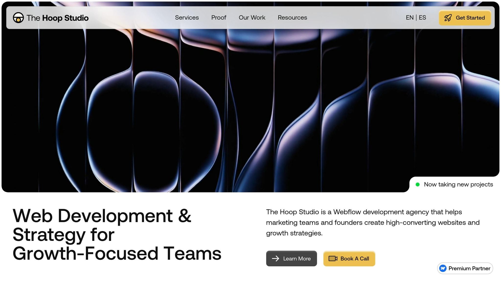
The Hoop Studio takes Webflow's technical strengths and builds on them to craft landing pages focused on conversion. Each page starts with a clear connection between the paid ad copy and the headline on the landing page. This ensures visitors immediately see what they expected, reducing bounce rates and keeping them engaged.
To streamline the user experience, The Hoop Studio keeps form fields to a minimum, asking only for essential details, and strategically places calls-to-action throughout the page. Webflow's CMS also allows for dynamic, personalized content, which has been shown to convert 202% better than static alternatives.
For teams managing ongoing campaigns, The Hoop Studio offers retainer plans starting at around $3,125 per month. These plans include ongoing optimization, A/B testing, and performance updates based on real traffic data, ensuring your landing pages stay effective over time.
Creating a landing page that drives conversions boils down to three key elements: alignment, clarity, and focus. Start with a headline that mirrors your ad’s promise. When visitors see the exact offer they clicked on, it reassures them they’re in the right place. This alignment, often referred to as message match, forms the backbone of a successful landing page, guiding users effortlessly from curiosity to action.
Your page’s structure and messaging must work hand in hand. The hero section should immediately answer three critical questions: What is this? Is it for me? What should I do next? Once you’ve nailed this clarity, layer in trust-building elements like testimonials and proof points to back up your offer. Keep forms short and to the point to avoid losing potential leads, and place CTAs thoughtfully throughout the page. Studies show that dedicated landing pages can convert up to 65% better when they stick to one clear objective.
Mobile optimization is non-negotiable. With over 80% of visits coming from mobile devices, your design has to cater to smaller screens. Focus on fast load times - under three seconds is ideal - and ensure buttons are thumb-friendly, at least 48 pixels tall. These small adjustments can significantly impact user experience and, ultimately, boost website conversion rates.
Every element on your landing page should serve a purpose. Cut out navigation menus that might pull visitors away, use genuine social proof instead of vague testimonials, and commit to ongoing testing. Even minor tweaks - like reducing form fields, speeding up load times, or repositioning CTAs - can transform a campaign from a money drain into a revenue generator.
To check message match, look at how well your ad and landing page align in terms of visuals, tone, and promises. The headline, keywords, offers, and visuals on your landing page should directly reflect what your ad communicates. This alignment helps establish trust, lowers bounce rates, and boosts conversions. Performing a quick audit is an easy way to ensure everything lines up and provides a smooth experience for users.
Testing different variations of your call-to-action (CTA) is a smart starting point since it plays a big role in boosting conversion rates. Experiment with details like the button text, its color, and where it's placed on the page. Beyond CTAs, try tweaking other key elements like headlines, visuals, and the overall layout. These core components help reveal what clicks with your audience, giving you the insights needed to fine-tune your landing page for better results.
Multi-step forms are a great way to boost user engagement and increase conversions. By breaking down long or complicated processes into smaller, easier-to-handle steps, they make tasks like lead generation or sign-ups feel less daunting. This approach reduces the likelihood of users abandoning the process.
These forms work by encouraging micro-commitments - small actions that build momentum - and creating a sense of progress. As users move through each step, they’re guided along a structured path, making it more likely they’ll complete the entire form.