

Insights
Conversion
Copy Link


Write a clear designer brief that sets conversion goals, audience, key messages, required elements, and technical specs.
When briefing a designer for a landing page, clarity and focus are everything. A vague brief leads to delays and revisions, while a precise one ensures faster results and better outcomes. Here's how to do it right:
A well-structured brief saves time, reduces costs, and ensures the landing page meets your goals. Start with specific goals, audience insights, and a clear message to get the best design results.
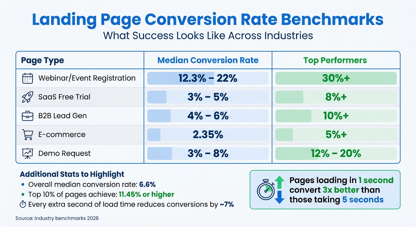
Landing Page Conversion Rate Benchmarks by Industry and Page Type
Every designer needs a roadmap, and that starts with clearly defined priorities. Before diving into wireframes, you need to outline what success looks like in measurable terms.
Here’s the problem: when you ask visitors to choose between options like "Start Free Trial", "Book a Demo", "Watch a Video", and "Download the Guide" all at once, you’re overwhelming them. This phenomenon, known as decision paralysis, is backed by research. Pages with multiple equally weighted calls-to-action (CTAs) perform worse than those with one clear focus.
Your primary action should tie directly to a measurable business goal, such as “increase demo requests from enterprise accounts to 200 per campaign.” This clarity transforms everything - from how your headlines are structured to where your CTAs are placed.
Take the example of Ram Prakash at GRODE. In early 2026, his team revamped an email-to-demo campaign for Moxo. Instead of a generic "product launch" approach, they zeroed in on a specific goal: driving 200 demo requests from enterprise accounts. The result? A CTA-focused layout with a clear benefit hierarchy that boosted demo requests from 80 to 187 per campaign - a 2.3x increase.
Your primary CTA should align with your audience’s stage in the buying journey. On top-of-funnel pages, low-commitment actions like "Download the Guide" work best. For bottom-of-funnel pages, prioritize high-intent actions like "Book Your Demo". The phrasing of your CTA is just as critical. Swap generic terms like "Submit" for first-person, action-oriented phrases like "Start my free 14-day trial" or "Send me the free guide." Personalized CTAs have been shown to convert 202% better than generic ones.
While the primary goal should be front and center, a secondary action can serve as a fallback for users who aren’t ready to commit. However, this secondary CTA should complement the primary goal - not compete with it.
For instance, if your main goal is "Book a Demo", a secondary action like "Watch a 2-Min Video" can provide additional context for hesitant users. Ram Prakash applied this strategy to a B2B SaaS landing page. Initially, the page featured four competing CTAs: Free Trial, Request Demo, Download Datasheet, and Contact Sales. By narrowing the focus to "Demo Requests" as the primary goal and "Watch 2-Min Video" as the secondary option, demo requests rose by 34%.
Design plays a big role here. Primary CTAs should stand out with bold colors and prominent placement. Secondary CTAs, on the other hand, work best as "ghost buttons" with muted colors or transparent backgrounds. The idea is to gently guide users toward the primary action without distracting them.
Vague goals lead to vague results. Be specific about what you’re measuring - whether it’s form completion rates, clicks on the primary CTA, or the percentage of visitors scrolling to key sections like pricing. These metrics directly influence design decisions, from button size to page length.
For context, the median conversion rate for landing pages across industries is 6.6%, but the top 10% achieve 11.45% or higher. Here’s a breakdown of benchmarks to aim for:
| Page Type | Median Conversion Rate | Top Performers |
|---|---|---|
| Webinar/Event Registration | 12.3% – 22% | 30%+ |
| SaaS Free Trial | 3% – 5% | 8%+ |
| B2B Lead Gen | 4% – 6% | 10%+ |
| E-commerce | 2.35% | 5%+ |
| Demo Request | 3% – 8% | 12% – 20% |
Don’t forget technical performance. A slow-loading page can ruin even the best design. Every extra second of load time reduces conversions by about 7%. If your Largest Contentful Paint (LCP) exceeds 2.5 seconds, you’re losing potential leads before they even see your offer. Make sure your brief includes performance standards, so your designer can optimize image sizes and reduce unnecessary code from the start.
With clear goals and metrics in place, your team can create a design that delivers results.
To create a landing page that truly connects and converts, your brief must thoroughly define the audience. Every design choice should reflect their needs, preferences, and behaviors. Without this foundation, designers are left guessing, which can lead to missed opportunities.
"Design isn't decoration. It's the interface between your offer and your buyer's decision. Without understanding that decision, designers are just guessing." - Ram Prakash, Founder and Creative Director, GRODE
The numbers back this up: companies with strong design practices grow revenue 32% faster than their competitors. But this growth only happens when designers are solving the right problems for the right people. A well-defined audience brief is key - especially when every $1 invested in UX design can deliver a $100 return on average.
Start by outlining the basics: age range, job titles, industries, and levels of seniority. Then, dig deeper into behavioral patterns. For example, a Chief Marketing Officer (CMO) might browse your landing page on their phone late at night, while a financial analyst could be viewing it on a desktop during work hours.
Technical know-how and device preferences are also critical. A developer might expect detailed specs and code examples, while a non-technical executive would respond better to simplified visuals and outcome-driven messaging. If most of your audience uses mobile devices, your designer needs to prioritize mobile-first design.
Don’t forget to document entry sources. A user clicking on a LinkedIn ad about "reducing manual reporting" has a different mindset than someone Googling "best CRM software." Aligning the landing page copy with the ad or keyword that brought them there can increase conversion rates by two to three times. Designers need this information to create a seamless and effective user experience.
Understanding your audience’s pain points is where the real insight lies. Go beyond vague statements like "users want better reporting." Instead, describe the specific challenge: "A Head of Revenue spends three hours every Monday manually pulling data from five tools and formatting it in Excel." This level of detail helps designers craft solutions that directly address the problem.
"Designers can only solve the problem you describe - and most briefs describe the wrong problem, or no problem at all." - Anant Jain, Creative Director, Designpixil
Awareness levels also play a big role. Is your audience problem-aware (they know they have an issue), solution-aware (they know solutions like yours exist), or product-aware (they know about your brand specifically)? For example, a problem-aware audience might need educational content to show the problem is solvable, while a product-aware audience may just need to see why your solution is the best.
If you have access to real user feedback - whether from sales calls, customer interviews, or support tickets - include it in your brief. These firsthand accounts can provide invaluable insights into what your audience struggles with and what they value most.
To design a landing page that converts, you need to identify the key objections that might hold your audience back. In B2B contexts, common concerns include price, credibility, complexity, and risk. Designers need to know which of these is most relevant so they can prioritize the right messaging and visuals.
For instance, if your audience is primarily CFOs focused on ROI, the page should highlight cost comparisons and ROI statistics. On the other hand, if IT Directors are worried about complexity, the design should showcase simplified implementation timelines and ease-of-use visuals.
| Doubt Type | Audience Concern | Design Approach |
|---|---|---|
| Price/Value | "Is this worth the investment?" | Show ROI stats, cost comparisons, or value proof |
| Credibility | "Can I trust this company?" | Include customer logos, testimonials, and case studies |
| Complexity | "Is this too hard to set up?" | Use simplified UI screenshots and implementation timelines |
| Risk | "What if it doesn't work for us?" | Highlight guarantees, free trials, and exit options |
It’s also crucial to distinguish between decision-makers and influencers. For example, an IT Director might prioritize security and cost of ownership, while a Marketing Manager might care more about ease of use and fast results. If your landing page needs to appeal to both, your designer should know which persona is the primary target and how to address each group effectively.
Finally, provide "anti-references" - examples of design styles or websites that your audience would find unappealing. These can serve as guardrails, helping your designer avoid approaches that might alienate your audience.
Once you’ve nailed down your conversion goals and audience insights, it’s time to craft your value proposition and key messages. These elements shape the story your design will tell. Without a clear message hierarchy, your design risks becoming chaotic, leaving users confused and reducing conversions.
"Design hierarchy requires decision hierarchy." - Ram Prakash, Creative Director, GRODE
Always finalize your message hierarchy and copy before starting the design process. Placeholder text often leads to generic designs that miss the mark.
Begin with a core benefit headline that highlights your main value. Follow it with a subheadline that explains how you deliver on that value and a USP (unique selling proposition) to set your offer apart. For example, TyresOnTheDrive nailed this with the headline: "Expert Tyre Fitting At Your Home or Work." This simple yet effective message clearly communicated their differentiator, helping potential customers decide in seconds.
Focus on the outcomes your audience cares about instead of just listing features. For instance:
Lead with benefits - how your product or service improves their life or business - and use features as supporting evidence.
Here’s an example of how this works in action: In January 2026, Ram Prakash redesigned a product launch email for Moxo. By focusing on a benefit-driven layout and addressing enterprise trust concerns, the campaign saw demo requests jump from 80 to 187 - a 2.3x increase.
Clarify the one main action you want users to take, whether that’s “Book a Demo” or “Start Free Trial.” A single, clear CTA often outperforms multiple options. A/B testing shows that a single primary CTA can achieve a 4.2% conversion rate, compared to 2.1% when three equal CTAs are presented.
Use the inverted triangle technique to structure your content, starting with the most critical information and following up with supporting details. Organize your content into three levels of priority:
| Priority Level | Content Type | Visual Treatment Goal |
|---|---|---|
| Primary | Value Proposition & Main CTA | Bold typography, central placement, highest contrast |
| Secondary | Trust Signals & Proof Points | Icons, testimonials, or visuals near the CTA |
| Tertiary | Features & Technical Details | Scannable lists, lower visual weight, below-the-fold placement |
For skimmers, break down benefits into bullet points. On media and entertainment landing pages, keeping content under 350 words often leads to better conversions.
This approach ensures your design supports your key messages rather than competing with them.
Communicate to your designer which messages deserve the most visual emphasis. For example:
Tailor the design to the funnel stage. Top-of-funnel pages should be visually engaging and easy to skim, while bottom-of-funnel pages need bold CTAs and content that addresses objections. Be clear about the desired emotional tone - whether the brand should feel “bold,” “approachable,” or “calm” - to guide choices around colors, typography, and imagery.
When sharing design references, explain what works about them. Instead of saying, “Make it like this,” point out specifics like how the headline and white space work together to enhance clarity. Clearly define what’s not a priority to avoid wasting time on unnecessary design elements.
"Clarity trumps persuasion." - Bob Kemper, Marketing Experiments
Lastly, ensure message match between your landing page and the ad or email that brought users there. A headline that aligns with the original message builds trust and relevance, which can significantly boost conversions.
Once you've nailed down your value proposition and audience insights, it's time to focus on the design elements and layout that will drive conversions. This section outlines the essential components and flow for creating a landing page that not only grabs attention but also guides visitors toward taking action.
Here’s how to structure your landing page for maximum impact:
Midway through the page, place detailed social proof, such as testimonials or case studies, alongside a secondary CTA. Before the final CTA, include an objection handling or FAQ section to address common concerns, like pricing or security.
Wrap up with a final CTA, essentially a repeat of your primary action, for visitors who’ve scrolled through the entire page.
"Every element on the page should serve one of five jobs: stop the scroll, earn trust, explain value, remove doubt, or make the ask. If it doesn't, cut it."
- Inzimam Ul Haq, Founder, Codivox
One key rule: remove all navigation menus. By eliminating global headers, footers, and social icons, you reduce distractions and keep visitors focused on your CTA. Research shows that landing pages with a single CTA can convert up to 266% better than those with multiple links.
To keep your landing page aligned with your brand, follow these visual guidelines:
"The visual quality of your product screenshots and UI mockups is doing more conversion work than most teams realize."
- Ruslan Smirnov, Founder, Memorable.design
Maintain consistency by using the same colors, fonts, and imagery across your ads, emails, and landing page. This helps reinforce your brand and avoids confusing visitors. Also, use ample whitespace around key elements like CTAs to reduce visual clutter and make your page easier to navigate.
Your landing page should guide visitors through a logical sequence that leads to conversion. Here’s the flow:
The design should match your product type. For example, SaaS tools often benefit from a product-first design with UI visuals upfront, while AI tools or creator products might work better with a story-driven layout that builds emotional tension. For fintech or marketplaces, a social proof-heavy design with testimonials and logos above the fold can be effective.
Make sure your page communicates its key message within 5 seconds. For mobile users, who often make up 60% to 75% of traffic, place your primary CTA in the bottom-center - this "thumb zone" placement ensures it's easy to tap and visible without scrolling.
Use size and color to emphasize priority. Headlines should be the largest element, and high-contrast colors should be reserved for CTA buttons. Opt for first-person, action-oriented CTA text, like "Start my free trial", instead of generic phrases like "Submit".
To ensure your landing page hits its conversion goals, pair your insights about the audience with practical examples. Showing your designer real-world, successful landing pages can help you communicate your vision clearly and eliminate unnecessary guesswork.
Share 3–5 examples of landing pages that have proven to drive conversions. For instance, in January 2026, Apexure analyzed Wagepoint's Canadian payroll landing page, which earned a "ConvertScore" of 87/100. This page stood out by using a warm earth-tone palette to differentiate itself from competitors and prominently displayed the stat "25,000+ Canadian businesses" to build instant credibility. These design choices - strategic use of color and quantified social proof - demonstrate how thoughtful decisions can boost conversions.
For SaaS products, consider pages tailored to specific goals:
If you're in the high-ticket services market, study "funnel-style" layouts. These often combine a premium, dark aesthetic with neon accents and focus on clarity, authority, and emotional appeal.
"The most persuasive thing you can do in the hero is name a specific number. '25,000+ Canadian businesses' does more work than any headline about being 'trusted' or 'easy.'"
- Waseem Bashir, CEO, Apexure
When you share examples, explain what makes each one effective. Highlight details like an outcome-driven headline, trust signals placed near the hero section, or how the page addresses potential objections before asking for a signup. This context helps your designer understand the reasoning behind the design and replicate its success.
Additionally, make it clear which features should be duplicated and which ones should be left out to stay focused on conversions.
Be precise about the elements you want to incorporate or skip. For example:
Keep forms simple - ideally, just one field (e.g., email) - to increase completion rates. Also, avoid distracting animations like parallax effects that can cause nausea or slow mobile performance. Instead, opt for subtle micro-interactions that enhance usability.
"'Automate your client onboarding in under 10 minutes' outperforms 'Our powerful onboarding platform' every time. The first tells the visitor what they get. The second tells them what you built."
- Ruslan Smirnov, Author, Memorable Design
Finally, define a clear hierarchy of design priorities to help your team focus on what matters most.
Organize design elements into three categories: "Must Have", "Important", and "Nice to Have."
Provide a wireframe as a non-negotiable starting point to lock in the structure before diving into visual details. Be specific when referencing examples - e.g., "Use a hero section layout like Stripe's but apply Slack's color palette." This approach removes ambiguity while still giving your designer room to be creative.
Before diving into the design process, your designer needs to know the technical parameters. Without this clarity, you risk delays and a landing page that doesn’t align with your systems. Be upfront about your platform, performance goals, and post-launch needs to avoid costly surprises.
"Skipping [technical requirements] almost always leads to surprise costs later when the agency discovers halfway through the build that you need CRM integration or a specific hosting setup."
- Lena Tarhonska, Co-founder & CEO, Vezert
Just as a creative brief sets the tone for design, technical guidelines ensure your landing page functions seamlessly and meets integration and performance goals.
Start by identifying the CMS or platform you’ll use - whether it’s Webflow, WordPress, or Next.js. Each platform has its own strengths and constraints. For example, Webflow offers a visual development interface that generates clean code and includes built-in localization features, making it easier to adapt content for different audiences. Sharing these details early lets your designer take advantage of the platform's capabilities.
Next, outline the third-party tools your page needs to connect with. Common integrations include CRMs like HubSpot or Salesforce, email marketing platforms like Mailchimp or ActiveCampaign, analytics tools such as GA4 or Hotjar, and payment gateways. If your form needs to trigger CRM automation, make that clear. Similarly, if you’re processing payments or collecting sensitive data, the design must include security badges and trust signals to reassure users. Accessibility requirements, such as meeting WCAG 2.1 AA standards, should also be defined upfront, as they influence design choices like color contrast and navigation.
Finally, clarify file formats and handoff preferences. If you need deliverables in Figma, Adobe XD, or another format, specify that along with naming conventions and storage locations like Google Drive. This avoids confusion when passing files to your development team.
These details ensure the design transitions smoothly from concept to execution.
Page speed is critical for conversions. Pages that load in 1 second convert three times better than those that take 5 seconds. Each additional second of load time reduces conversions by about 7%. Set a clear maximum page load time, ideally under 2 seconds, and specify the traffic volume the page should handle.
With 63% of web traffic coming from mobile devices, mobile responsiveness is non-negotiable. Your designer should test the page across various browsers and devices. Use Core Web Vitals as a benchmark for performance, and suggest tools like image compression or Content Delivery Networks (CDNs) to meet load-time goals. Also, remember that users form opinions about a site in just 0.05 seconds, so place critical information and the main call-to-action (CTA) "above the fold" where it’s immediately visible.
Hitting these performance benchmarks is essential for boosting the page's conversion potential and finding ways to boost website conversion rates.
Be clear about what you’ll need after the page goes live. Will you require ongoing maintenance, A/B testing, or updates? For example, if you plan to test different headlines or CTAs, the designer should create a page that allows for easy edits. Additionally, mention if you’ll need help with future integrations or updates for new tools or campaigns. Setting these expectations upfront ensures the designer can account for them in their planning, avoiding miscommunication later on.
A well-crafted brief is the backbone of a landing page that drives conversions, seamlessly connecting the design to your business objectives. By clearly defining conversion goals, offering detailed audience insights, highlighting your value proposition, specifying design elements, sharing examples, and setting technical requirements, you equip your designer with everything they need to create impactful results.
When your brief is clear, it minimizes unnecessary revisions and keeps the design on track. As Anant Jain, Creative Director at Designpixil, aptly says:
"The quality of a design brief is the single biggest predictor of the quality of the design you get back".
On the flip side, vague or incomplete briefs leave designers guessing, leading to delays and additional rounds of revisions. The benefits of a focused brief aren’t just qualitative - they’re measurable too. For instance, a recent redesign with a detailed brief led to a significant jump in demo requests, as seen in these landing page layout case studies.
A clear brief also saves both time and money. Projects with clearly defined requirements are more likely to finish on schedule and within budget. Poorly scoped projects, however, often spiral out of control, with over 30% of large-scale digital projects exceeding their budgets. Ram Prakash sums it up perfectly:
"Speed comes from clarity, not pressure".
In fact, a strong brief can cut timelines dramatically, reducing weeks of back-and-forth to just a single week of focused progress.
Your brief is the bridge between your marketing goals and the final design. Put in the effort upfront, and you'll see the results in both time saved and outcomes achieved. If you need expert help, our landing page development services can turn your brief into a high-performing reality.
Before kicking off the project, make sure your designer has a clear and detailed brief. This should cover your project goals, insights about your target audience, and specific design preferences. Be as precise as possible - include objectives, the core message, expected deliverables, preferred file formats, and even reference examples. A well-thought-out brief helps set expectations, streamlines communication, and minimizes the need for revisions.
To select a main call-to-action (CTA) and a secondary one without affecting conversions, prioritize clarity and strategic placement. The main CTA should directly support the page's primary goal, stand out clearly above the fold, and be easily tappable on mobile devices. A secondary CTA can highlight less critical actions, but it should never overshadow the main one. Running A/B tests on placement and wording can help fine-tune performance for better results.
When crafting a landing page brief, it's crucial to include clear technical requirements. These should cover:
These components ensure the designer fully understands the project scope and technical boundaries, reducing miscommunication and the need for revisions.