



Insights
Webflow
Copy Link




Step-by-step brief covering goal, audience, offer, forms, tracking, and approvals to launch landing pages right.
Most landing pages fail before the build starts. If I leave out the goal, audience, offer, form rules, or tracking, my team has to guess - and that usually means more revisions, slower launches, and weaker conversion rates.
Here’s the short version: if I want the page built right the first time, I need to brief six things up front:
A few numbers from the article make the point fast:
That means my brief should not just say “build a landing page.” It should say:
If I hand over those details before design starts, I cut guesswork and give the page a better shot at hitting its target on day one.
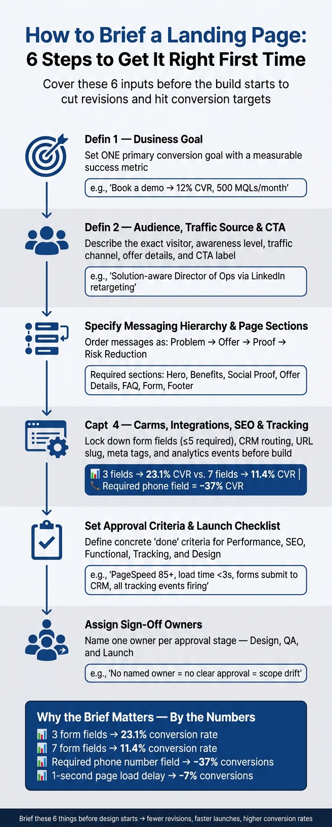
How to Brief a Landing Page: 6 Steps to Get It Right First Time
Start the brief with a short project summary. It should explain why the page exists, what it needs to do, and which limits the team has to work within. If you skip that, the build starts without a clear point of reference.
A landing page should focus on one primary action. Choose the single step you want visitors to take, then make that the center of the brief.
Example: Book a demo; target a 12% conversion rate and 500 marketing-qualified leads per month.
Be clear about the deadline, the traffic source, and any fixed limits the build must follow. Add must-have features, required integrations like CRM, analytics, or automation, plus any brand or legal rules that can't change, such as GDPR and CCPA requirements, brand guidelines, pricing or legal disclaimers, and a GDPR-compliant opt-in.
| Project Summary Element | Description | Example |
|---|---|---|
| Primary goal | The single action you want the user to take. | Book a demo |
| Success metric | How you will measure the page's performance. | 12% conversion rate; 500 marketing-qualified leads/month |
| Deadline | The fixed date the page must be live. | Launch by October 15, 2026 |
| Traffic source | Where the visitors are coming from. | LinkedIn Paid Ads (Retargeting) |
| Non-negotiables | Brand or legal rules that must be followed. | Must include GDPR-compliant opt-in |
Once the goal and scope are set, the next step is to pin down who the page is for, where the traffic comes from, and which CTA the build needs to support.
Once the goal and scope are set, the next step is simple: get clear on who's landing on the page and what the page needs to reflect back to them. If the ad promises one thing and the page says another, people leave. That mismatch is a fast way to lose conversions.
Don't stop at "our target customer." Get specific.
Spell out the visitor's role, company type, company size, biggest pain points, buying stage, and what they already know from the ad, email, or retargeting campaign. The more exact you are here, the easier it is to write a page that feels like it was made for that person.
It also helps to assign an awareness label: unaware, problem-aware, solution-aware, product-aware, or most aware. That label sets the balance between education, proof, and CTA friction. In plain English, it tells you how much explaining the page needs, which sections matter most, and how direct the CTA should be.
The page should match the intent behind the traffic source.
Paid search traffic usually needs direct proof. Paid social often needs more story and context. Retargeting traffic has already seen the brand, so the page can spend less time on the basics and more time handling objections, FAQs, and proof.
Here's a good rule: echo the promise that brought the visitor there. If the LinkedIn ad says "Free 30-minute marketing audit for U.S. e-commerce brands," the hero headline should reflect that. It shouldn't drift into something vague like "Grow your business faster." Put the ad copy, email subject line, or referral context directly into the brief so the team can line things up.
Paid social visitors are a different case. They were interrupted mid-scroll, so they may need more context and a lower-friction next step, like "Get the guide" instead of "Book a sales call."
You also want to document the offer in plain terms:
For example: "Free 7-day Webflow audit for U.S. SaaS companies with $1M+ ARR, delivered as a slide deck within 5 business days, no obligation."
That kind of detail shapes the hero message, the What you get section, and any legal or terms copy that needs to appear.
Be precise with the CTA. Name the exact primary CTA label, where it appears, and how it should behave on mobile.
If there's a secondary action, define that too. Keep it as a text link, not a second button fighting for attention. For example: "Primary: 'Schedule your free 30-minute audit' as a button in hero, mid-page, and final section. Secondary: 'View pricing' as a text link below the hero CTA only."
If the offer has a promo price, say exactly how it should be shown. For example: "Show regular price $399 and promo price $249 in USD, with a 'Save $150' tag, and add 'Limited-time offer for new U.S. customers only' as microcopy beneath the CTA."
These inputs shape the messaging order and the sections the page needs next.
| Audience & CTA Brief Element | What to Document | Example |
|---|---|---|
| Visitor role & company | Job title, company type, size, and location | Director of Operations, U.S. manufacturing, 100–500 employees |
| Pain points & buying stage | Top 1–2 problems and awareness level | Inventory inaccuracies; Solution-aware |
| Traffic source | Channel, targeting, and prior messages seen | Paid social; ad copy: "Free 30-min audit" |
| Offer details | Type, eligibility, pricing in USD, and duration | Free 7-day audit; $1M+ ARR; delivered in 5 business days |
| Primary CTA | Exact label, placement, and frequency | "Schedule your free 30-minute audit"; hero, mid-page, final section |
| Secondary CTA | Label, format (text link vs. button), and location | "View pricing"; text link below hero CTA only |
With the audience, traffic source, and CTA locked in, the next step is to set the message order and page sections. This gives the team a clear content hierarchy before anyone starts making layout calls.
Write the page’s messages in priority order: problem, offer, proof, risk reduction.
For example: (1) We solve X problem for Y audience. (2) Here’s exactly what they get. (3) Here’s proof it works. (4) Here’s why the risk is low.
That order matters. It helps the page say the right thing at the right time instead of dumping everything on the visitor at once.
Once the message order is clear, list every section the page needs and note which assets already exist. This keeps the build from getting stuck because someone thought a testimonial video was ready when it wasn’t.
| Section | Required Assets | Purpose |
|---|---|---|
| Hero | Headline, subheadline, primary CTA, visual asset | Match the campaign promise |
| Benefits | Benefit-driven copy, icons or graphics | Explain the solution |
| Social proof | Testimonials, client logos, case study snippets | Prove the offer |
| Offer details | Pricing, deliverables, timeline, eligibility | State deliverables and conditions |
| Objections/FAQ | Answer-first copy for key concerns | Resolve objections |
| Form/CTA | Field list, validation rules, privacy policy link | Capture leads with minimal friction |
| Footer | Privacy policy, secondary links | Keep compliance links accessible |
Mark each asset as ready, in progress, or needed.
Every page has a short list of reasons people don’t convert, though there are many ways to boost website conversion rates once those barriers are identified. Maybe the price feels too high. Maybe the process sounds like a hassle. Maybe they’re not sure the offer fits their situation.
Spell those out. Then map each objection to a section of the page so the answers appear in sequence, not as a random pile of concerns.
At the same time, list the trust signals you already have on hand, such as:
Then add a short tone note. Tone of voice: direct, confident, no jargon, U.S. spelling, active voice.
Once the message hierarchy is set, define the form, integrations, SEO basics, and tracking.
Technical details save time later. Your brief should lock down forms, integrations, SEO, and tracking before the build starts. Once those pieces are set, the team can move without second-guessing basic setup.
List each form type and every field by name, field type, and whether it’s required or optional. For U.S. forms, spell out accepted formats for phone numbers, ZIP Codes, and currency. Also, keep required fields to five or fewer.
That limit matters. Conversion rates drop from 23.1% at 3 fields to 11.4% at 7 fields, and making a phone number required by itself can cut conversions by about 37%. If a field isn’t needed right away, move it to a follow-up step.
You should also define how validation works. Does it fire when someone clicks out of a field, or only after they hit submit? Write the error copy exactly as it should appear. For example: Please enter a valid US phone number like 123-456-7890.
Then spell out what happens after a successful submission:
For each integration, explain the exact post-submit flow. Don’t leave this at “send to CRM.” Be specific: create or update a contact in HubSpot, assign it to the right pipeline, and enroll it in a nurture sequence.
If lead scoring is part of the setup, define the rules in plain English. Which fields decide qualification? What score moves a lead to a senior rep? What score or condition routes the lead into a self-service onboarding funnel? Those details keep sales and ops from sorting it out on the fly.
On the SEO side, include the URL slug, title tag, and meta description in U.S. English. Keep the title tag at 50–60 characters and the meta description at 140–160 characters. State indexing status with no wiggle room:
index, follow for pages meant to ranknoindex for paid-traffic-only campaignsAlso include Open Graph title, description, and image tags.
Once launch visibility is mapped out, the brief should name the exact events the page needs to track.
List every event that must fire at launch. Use one naming pattern across all events so reporting doesn’t turn into a mess later. Add attributes like page name, campaign ID, and variant when needed. Also mark which events count as primary conversions and which are micro-interactions, and note where each event goes: GA4, Tag Manager, or Segment.
If scroll tracking is included, define the thresholds up front. A common setup is 25%, 50%, 75%, and 100%. That way, everyone reads the same data the same way.
| Event | Trigger | Type |
|---|---|---|
lp_section_cta_click |
Primary CTA button click | Primary conversion |
lp_form_submit_success |
Successful form submission | Primary conversion |
lp_form_submit_error |
Failed submission attempt | Diagnostic |
lp_scroll_depth_50 |
User scrolls past 50% of page | Micro-interaction |
lp_video_play |
Video play initiated | Micro-interaction |
Set 7-day, 14-day, and 30-day checkpoints for traffic, conversion, lead quality, and pipeline value. At 30 days, measure pipeline value in USD against the success criteria set in section 1. Assign one owner to each review so there’s no confusion about who checks what.
These requirements feed the approval criteria and handoff checklist. Next, turn these requirements into approval criteria and a launch checklist.
When approval criteria aren't clear, reviews get subjective fast. Then scope starts to drift. Defining what approved means before the build starts helps keep the project on track.
Each approval stage needs checks that are concrete and easy to test. Vague notes like “looks good” or “seems fast” lead to the same back-and-forth the brief should stop in the first place.
| Approval Category | Specific "Done" Criteria |
|---|---|
| Performance | PageSpeed Insights score 85+; load time under 3 seconds; global CDN active |
| SEO | Clean semantic HTML; meta titles and descriptions set; canonical tags verified; sitemap generated; SSL active |
| Functional | Forms submit to CRM; validation rules working; redirects verified |
| Tracking | Analytics events firing; conversion pixels verified; reporting verified |
| Design | Mobile-responsive; keyboard navigation works; labels and contrast pass review; brand assets match the brief; one primary CTA; no extra navigation competes with the primary CTA; hero, proof, and form sections match the approved wireframe |
A 1-second delay in page load time can reduce conversions by 7%. So performance isn't just a nice extra. It directly affects results.
The best move is to turn these checks into a short brief and launch checklist.
Use the same criteria to guide handoff and launch. A good brief should answer the basics in plain English: what the page needs to do, who it's for, where traffic comes from, what the offer is, how the page should flow, and what counts as done.
Here's a simple structure you can use:
Before the build starts, make sure the Figma files, final copy, and all brand assets have been handed off. Before launch, test every form path end-to-end, verify tracking, confirm CRM routing, and approve redirects.
It also helps to name the sign-off stakeholders for each stage - design, QA, and launch. That way, approval is clear and feedback stays focused.
When the basics are covered, the build can move without guesswork. These six inputs help cut rework, move the project along, and give the page a better shot at boosting conversion rates from day one.
The client, marketer, or growth team should own the landing page brief.
They set the page’s conversion goals, audience, traffic source, offer, messaging order, and technical requirements. That work gives designers and developers a clear plan from the start.
When the brief is owned well, the page is much more likely to be built right the first time. It also helps cut rework, surprise costs, and mismatched expectations.
Before design starts, lock in your conversion goal, target audience, core message, and one clear offer. Then map the user journey so the page lines up with the traffic source and moves people toward action.
You should also confirm the page sections you need, any technical setup like CRM integrations or hosting, and your tracking plan. That cuts down on rework and makes sure every part of the page is there for a reason.
A landing page brief should be very detailed. It needs to spell out the conversion goal, target audience, key messaging, page elements, technical requirements, sitemap, content plan, and success metrics.
Getting these details in place early cuts ambiguity. It also helps stop scope creep, avoids surprise costs, and gives the team a much better shot at building the right page on the first pass.