



Insights
Conversion
Copy Link



Pinpoint why your landing page underperforms—clarify the message, match the ad, remove CTA/form friction, add trust, and speed up mobile.
Most landing pages don’t fail because of design. They fail because the offer is hard to grasp, the page doesn’t match the ad, the CTA adds friction, trust is weak, or the page is too slow on mobile.
If I had to diagnose a low-converting page fast, I’d start with these five checks:
A few numbers make the problem plain: the average landing page converts at 2.35%, top pages reach 5.31%, 53% of mobile users leave if a page takes more than 3 seconds to load, and cutting a form from 11 fields to 4 can lift conversions by 120%.
Here’s the short version of the fix:
Fix the first clear blocker, then retest. That usually works better than changing the whole page at once.
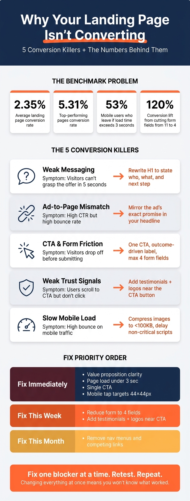
Landing Page Conversion: Key Stats & Quick Fixes
Weak messaging is often the main thing killing conversions. If the hero section doesn't make three things clear right away - who it's for, what problem it solves, and what to do next - people leave.
This is where feature-first headlines tend to fall flat. A line like "workflow automation software" says what the product is, but not why someone should care. "Cut your support response time in half" is much clearer because it points to the result.
The other big issue is ad-to-page mismatch. And this one can burn through paid traffic fast. If someone clicks an ad that promises a certain offer, price, or result, they expect the landing page to repeat that same promise. A click shows interest. It doesn't mean they've bought in yet. When the page doesn't match the ad, conversions drop. It can also hurt your Quality Score in Google Ads, which can push cost per click higher and waste budget on traffic that bounces right away. Once the click and the promise match, the hero has one job: say it fast.
A strong hero section has to handle four jobs at once: explain what you do, who it's for, the main benefit, and the next step. That's a heavy lift for a headline and subhead, so clear wording beats clever wording every time.
The fix is pretty simple. Start by matching the wording in your ad to your H1. If the ad makes a specific promise, carry that promise into the headline instead of swapping it out for a broad brand line. Then use the subhead to speak to the exact pain point.
This matters because most visitors don't stick around long enough to decode fuzzy copy. Analytics can help show whether people get past the fold. On an average landing page, scroll depth drops by about 15% with each full scroll down the page. If the hero isn't doing its job, fix the headline before anything else.
Before rewriting the page, compare the ad, the click source, and the hero. You're looking for the first point where the campaign promise and the landing page stop matching.
| Messaging issue | What you see in behavior or analytics | Primary fix |
|---|---|---|
| Unclear offer or feature-first headline | High bounce rate; visitors leave without scrolling | Rewrite the H1 to focus on a specific outcome, not a product category |
| Ad-to-page offer mismatch | High click-through rate but high bounce rate | Make the ad's specific promise - pricing, offer, or result - the primary headline |
| Vague subheadline | Low time on page, little engagement below the fold | Use the subhead to name a specific audience pain point |
| Audience mismatch | Low form completion; visitors worry they are in the wrong place | Align the audience definition between your ad and your landing page |
The page should feel like a direct continuation of the click, not a detour.
Once your message lines up with the click, the next problem is friction. You can have solid traffic and strong copy, and still lose conversions if the page makes people work too hard. Too many goals on one page, weak button placement, and forms that ask for too much too early are some of the biggest reasons pages underperform. People often don’t leave because the offer is weak. They leave because saying yes feels like a hassle.
One of the fastest ways to improve a page is to cut distractions. Navigation menus, social links, and secondary CTAs can work like exit signs. Removing navigation menus and other distractions can increase conversions by 10–25%.
Button copy matters too. Labels like "Submit" or "Learn More" are vague. They don’t spell out what happens next. More specific, outcome-driven labels - like "Get My Free Audit" or "Start My Free Trial" - can increase click-through rates by 40–90%.
From there, trim every extra step between interest and action. A strong landing page usually follows a simple flow: hero → benefits → social proof → objection handling → repeated CTA. Each section should push the visitor one step closer to taking action. If something competes with the CTA, cut it.
The CTA also shouldn’t appear just once. On longer pages, place it in the hero, again mid-page, and one more time at the bottom. That gives people a chance to act the moment they’re ready, without forcing them to scroll back to the top. It also helps to add a short note near each CTA, such as "No credit card required" or "Cancel anytime", to ease doubt right when it matters.
"If an on-page element doesn't help drive the visitor toward the CTA, consider removing it." - Jesse Sumrak, Webflow
If the CTA gets the click, the form has to close the deal. Forms are a major source of drop-off. Reducing form fields from 11 to 4 can increase conversion rates by 120%. A lot of forms ask for details the team doesn’t even need yet - phone number, company size, job title. Every extra field adds resistance.
A two-step form can help. Ask for just an email address first, then request more detail on the next screen. That lowers the first level of commitment and keeps more people moving forward. On mobile, make tap targets at least 44×44 pixels and keep body text at 16px or larger. Tiny buttons and small text make forms harder to complete and directly reduce form completion rates.
If your message lines up with the ad or email that brought people in, and the form is already short, there are usually two blockers left: trust and speed.
Even after fixing copy and form friction, pages can still miss the mark if they don't build trust fast. If visitors don't see clear signs that the offer is legit, they leave before they click. Adding strong social proof, like customer testimonials with photos, can increase conversions by 15% to 30%.
Speed is the other quiet problem. 53% of mobile users leave pages that take longer than 3 seconds to load, and each extra second can cut conversions by 7%. So even if a page looks polished on desktop, it can still struggle on mobile when images, video, and scripts are too heavy.
Put proof close to the action. A client logo strip, a security badge, a short testimonial with a real name and photo, or a line such as Trusted by 10,000+ customers placed right above or below the main button can make a big difference. It gives people reassurance at the exact moment they start to hesitate.
Privacy concerns can also stop form fills. A short privacy note near the email field helps reduce that anxiety.
| Trust gap | Observed symptom | Recommended fix |
|---|---|---|
| Lack of social proof | High traffic, low conversion rate | Add testimonials with real names, photos, and company logos |
| High perceived risk | Users scroll to CTA but don't click | Add No credit card required or Money-back guarantee near the button |
| Privacy concerns | High form abandonment rate | Include a brief privacy note near the email field |
| Credibility gap | High bounce rate on premium offers | Display recognizable client logos and specific measurable outcomes |
After trust, the next place conversions slip is page speed.

Webflow pages can lose their speed edge when teams pile on heavy assets or extra scripts. Start with media. Compress every image to under 100 KB and use WebP instead of PNG or JPEG. For video, skip large background files that drag load times down.
Then look at custom code embeds and tracking pixels. Every script added to a Webflow page can increase Total Blocking Time and delay interaction. Cut anything that isn't needed, and delay scripts that don't need to fire right away. Before making changes, verify conversion events in Google Analytics and use heatmaps to see where people get stuck.
| Performance issue | Metric or behavior affected | Suggested remediation |
|---|---|---|
| Oversized media | High bounce rate; slow Largest Contentful Paint (LCP) | Compress images to under 100 KB and use WebP format |
| Heavy third-party scripts | High Total Blocking Time; slow Time to Interactive | Remove unnecessary plugins and delay non-critical JavaScript |
| Tracking gaps | Missing or incomplete performance data | Verify conversion events in Google Analytics and use heatmaps |
If the page still underperforms after the earlier fixes, use this checklist to find what's still getting in the way of conversions.
Most landing pages miss the mark for a handful of predictable reasons: the value proposition isn't clear in the first five seconds, the headline doesn't line up with the ad, the CTA is buried or too vague, the form asks for too much, trust signals are missing, or the page loads too slowly on mobile.
The fix is simple in theory, but easy to mess up in practice: work one layer at a time. Start with the message. Then move to speed, CTA clarity, mobile, forms, and trust. If you change everything at once, you won't know what actually helped.
Also, don't treat the landing page like it's living on its own island. It's part of the full campaign path. The ad sets the expectation. The page needs to follow through. That's why the checklist below focuses on the fastest wins first.
| Priority | Category | Key action |
|---|---|---|
| Fix immediately | Value proposition | Headline answers what, who, and why in five seconds |
| Fix immediately | Load speed | Page loads in under 3 seconds; keep images lightweight and compressed |
| Fix immediately | CTA | One primary button with action-oriented copy |
| Fix immediately | Mobile | Buttons are at least 44 × 44 px and easy to tap |
| Fix this week | Form friction | Reduce fields; aim for 4 or fewer |
| Fix this week | Trust signals | Add testimonials with photos and recognizable client logos near the CTA |
| Fix this month | Distractions | Remove navigation menus and competing links |
Start with the first red flag. Fix it. Retest.
On Webflow pages, small tests usually beat one big redesign. Change one element, check the results, then move to the next.
Start with a diagnostic approach instead of guessing. Look at your analytics for signs of trouble, like a bounce rate above 70%, low time on page, or a big gap between mobile and desktop conversions.
Then check heatmaps. They can show whether people are clicking your calls to action or rage-clicking things that look clickable but aren’t.
Once you spot the rough patches, test the biggest friction points first:
That way, you’re not making random tweaks. You’re working on the parts most likely to hold people back.
Check for message match. Your landing page should feel like the next step after the ad, not a hard left turn.
The easiest place to start is the headline. It should reflect the ad’s main promise and use the same keyword, or something very close. That way, visitors land on the page and think, Yep, I’m in the right place.
The rest matters too. Your language, imagery, and branding should line up with what people just saw in the ad. If the offer changes, the visuals shift, or the message sounds off, you probably have a mismatch.
Place trust signals right next to your CTA. That’s often the last moment when people pause, hesitate, and decide whether to click.
Good options include friction reducers like "No credit card required" or "Free forever". You can also add nearby social proof, such as customer testimonials with real names and photos, recognizable client logos, or clear proof points like "12,000+ customers."